Wednesday, 14 December 2011

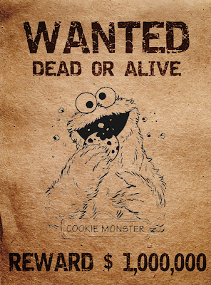
Final Wanted Poster


This is the wanted poster we will be using our narrative. We used a handmade one in our second rough cut, but have decided the footage is too dark and it is hard to read the poster; this is why we have designed one in photoshop using a black and white image of the cookie monster, added text and put an effect over the top to make it look old and worn. This will have a positive impact on our Mise en Scene and make it easier for the audience to understand the storyline. After printing the image off, i have also crumpled it up to give it even more of a creased effect and to look more realistic.
Thursday, 1 December 2011

Editing the Music Video 2


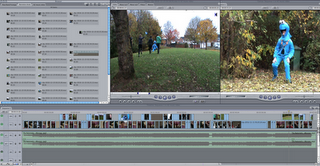
This is our work space within final cut express HD, this is our footage above and as you can see you have 2 lines of footage of which are performance shots shown in our first rough cut and narrative shots. I froze the performance footage, so it cant be tampered or changed, so we could just simply put our narrative in the top row as the top row is played first and where there is gaps, it will play the below footage. This was a very good technique as we could establish where the narrative fits best and to fit it all of the narrative in and in order, so it flows better. We have left gaps in the narrative so the band shots aren't totally lost and so the music video doesn't get to boring. Our second rough cut is much more advanced than our first as we have included our narrative shots so it has a story to follow within the song but with the band shots also; this is key as we don't want our audience to get bored of the video but we want it to have added meaning and humour influences in our music video and i think we have through the footage we have produced in our second rough cut.

Saturday, 26 November 2011

Rough Cut Feedback

We have showed our peers our second rough cut in order to gain some feedback. This is what they said:

Some shots need more lighting - There is some shots of the narrative where it is hard to see some of the props, making it difficult tick depict the storyline. We are going to resolve this by re-shooting the scenes that are too dark and replace them with the new shots.

Some shots are too long - Some of the shots in the second rough cut last too long and on screen it really makes the video drag. We are going to resolve this problem by editing more shots into the video so that it picks up the pace and cuts to the beat.

Some shots are too similar - Alot of the performance shots included in the rough cut are at the same angle and look very similar. The issue with this is mainly timing, we ran out of time to add more various shots into the video before the deadline. In our final edit we plan to include alot more of the footage that we shot in the video.

Friday, 25 November 2011

Rough Cut 2


This is our second rough cut. Our video has improved greatly as we have incorporated all of the narrative footage we plan to use alongside the original performance shots. We have structured the narrative shots around the performance and feel that it flows very well. The narrative shots we have included are based on our storyboard, although we have changed our ideas slightly to enhance the viewing pleasure of our music video. All in all we believe that the second rough cut is a great improvement from our first, based on the added narrative and tighter editing, however; there is still alot of room for improvement for our final edit.

Final Company Logo


This is our final company logo. As we found out it would be included on our digipak, we thought it best to edit the colours to suit the package design we plan to use. there was also a few rough edges that needed neatening up and editing in order to make the logo look more professional, and something that would actually be used in the music industry.

Editing the music video

This is me editing our music video into final cut express using the right and left screens effectively as the one on the left shows our footage in the drop down tab's which we have filmed and imported through I movie, and the one on the right shows the actual movie I have made to the music track which is 'Monster' by The Automatic as you can see the wave form below. I have cropped different types of shots together to make a continued footage throughout the song and a preview of this can be shown in our rough cut on youtube. (http://www.youtube.com/watch?v=Phbo-thOgcM) this is our rough cut link and can watch it in full, But this is only a preview of what we have filmed and doesn't include our narrative shots that will come in the second version of our rough cut.


Above is our work space where we can listen to the track imported from youtube this track has been frozen so it cant be cut or anything as when I am piecing all of the footage together along with the videos when I shrink them down the track doesn't it stays the same, a handy tool so I don't have to worry about the track as much its just the lip sync really. In this rough cut I have only used band shots as we don't want to give to much of our story away in the first preview of the song but as you can see on the left screen is some of our narrative footage which we will include in our second preview. I am using a technique of using the top line of footage as the band footage and the space below is going to be the narrative footage and then cut and delete it into place so it makes yet another full music video.

Thursday, 10 November 2011

Rough Cut 1


This is our first edited version of our music video for the track 'Monster' by the Automatic, it includes band shots at a variety of angles and at two locations, close up's of guitars and basses and meat shot's of singers lip syncing the song. I had edited this bit by bit to go with the song and sometimes cutting on the beat of the guitars and drums but mainly a different shot for each line of the song. We used a Sony video camera along with a tripod to film this and used our initiative with our own clothing and equipment used in the video. I used Final Cut Express HD to edit the pieces of video to the song 'Monster' and tried to get everything in good order so it flows easily.

Tuesday, 1 November 2011

Company Logo

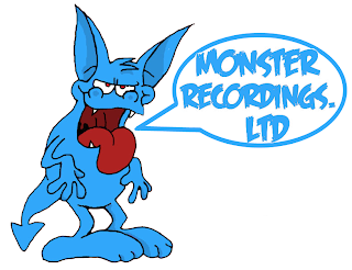
This is the company logo that we've made. We made it to show off our company and make it seem  legitimate (our music video/company) as all music companies tend to have a company logo and the monster picture firs with the name of our music video "Monster". I made it on photoshop and I got the outline of the monster of google images and I changed the colour and added jewelery to the monsters ears and tail and changed the colour of the monsters tongue. Next to the monster i got a speech bubble with the name of the company inside it as if the monster is saying it. The font is in the style of the hit single monster is and it's the song we are doing. I made the background dark red/maroon so the monster and the speech bubble stand out to people. I got the font from DaFont.com, A great site to get fonts from.

Animatic


This is the storyboard animatic, it includes the track monster by the automatic and also includes our storyboard which we created to kind of get a feel of what we want to with our music video and what shot goes where, its a rough idea and may change in the real video but its a starting block and will help the filming run more smoothly and fluently as a kind of guide to our programme of what goes where in the music video.

Monday, 31 October 2011

Inspiration

This is the official video for No-one knows by queens of the stone age.


Much like ours, the video is both narrative and performance based. Although the video isn't based on monsters, it does involve a Dear kidnapping the band and driving them away in their truck. It is of a similar humor and take to our video.

Inspiration

This is the official video for Monster

http://www.youtube.com/watch?v=o7X3LYGV_N8

As we are making a music video for this song we took major influence from the official video, without copying it exactly.


This shot shows a wanted poster of a monster pinned to a tree, we've used the idea of a wanted poster but in our video it gets posted through the door.


This shot shows one of the band members using a fishing net to try and catch the monster, we are also using a fishing net as one of our props.


This is a shot of the monster's foot. We will not be including a shot of the monster's foot in our music video, but we will be showing a footprint that the band find when they are searching for the cookie monster.

Thursday, 20 October 2011

Moodboard

This is the mood board i made for an indie music video using Photoshop. The mood board contains pictures of bands in the rock/punk/indie genres, as well as album covers. The mood board show ideas for styles, themes and camera shots that we can take inspiration from in our music video, we also get an idea of what costume/mise en scene we will be using.